for Client Visonmed
a redesign of Visonmed’s brand identity and company website to help it adapt to the global pandemic with flexibility.

Team
1 Designer (me) and 1 Developer
Type
Client Project (currently in development stage)
Duration
1 month
Tools
Sketch and Illustrator
They asked for
The Client
Visonmed has supplied a range of medical items to businesses worldwide for more than 15 years.
A redesign for their website to help them to improve brand trust during Covid-19, when they experienced a great increase in the number of clients and market competitiveness.
Problems
Structural Confusions: repeated but different navigation bars, only one tab has multiple sub tabs.
Seems Suspicious : news haven’t been updated for a long time, the cheap flash animation, weird login system.
Typical Web 2.0: users are expected to find information by themselves.
The Solution
More simplified and flattened information architecture.
Get rid of the dubious parts and elevate the brand through visual design.
Adapt it to Web 3.0, where the only thing users need to do is effortless scrolling.
Brand Keywords
Trustworthy / International / Quality
Drafts and Sketches
More Finalized Ones

Final Choice
With the logo that I recommended the most, I designed several iterations in different color choices and gradient uses. The client also liked my choice and we reached agreement very soon.
01Build Up Credibility
The homepage gives a quick but comprehensive impression of the company’s mission, products, and contact details.
02 Up to date
Clarification about COVID-19 protocols and buying processes.
03 Directness
Get to know the actual products and see which ones the potential clients want to order in large amounts.
04 Informative
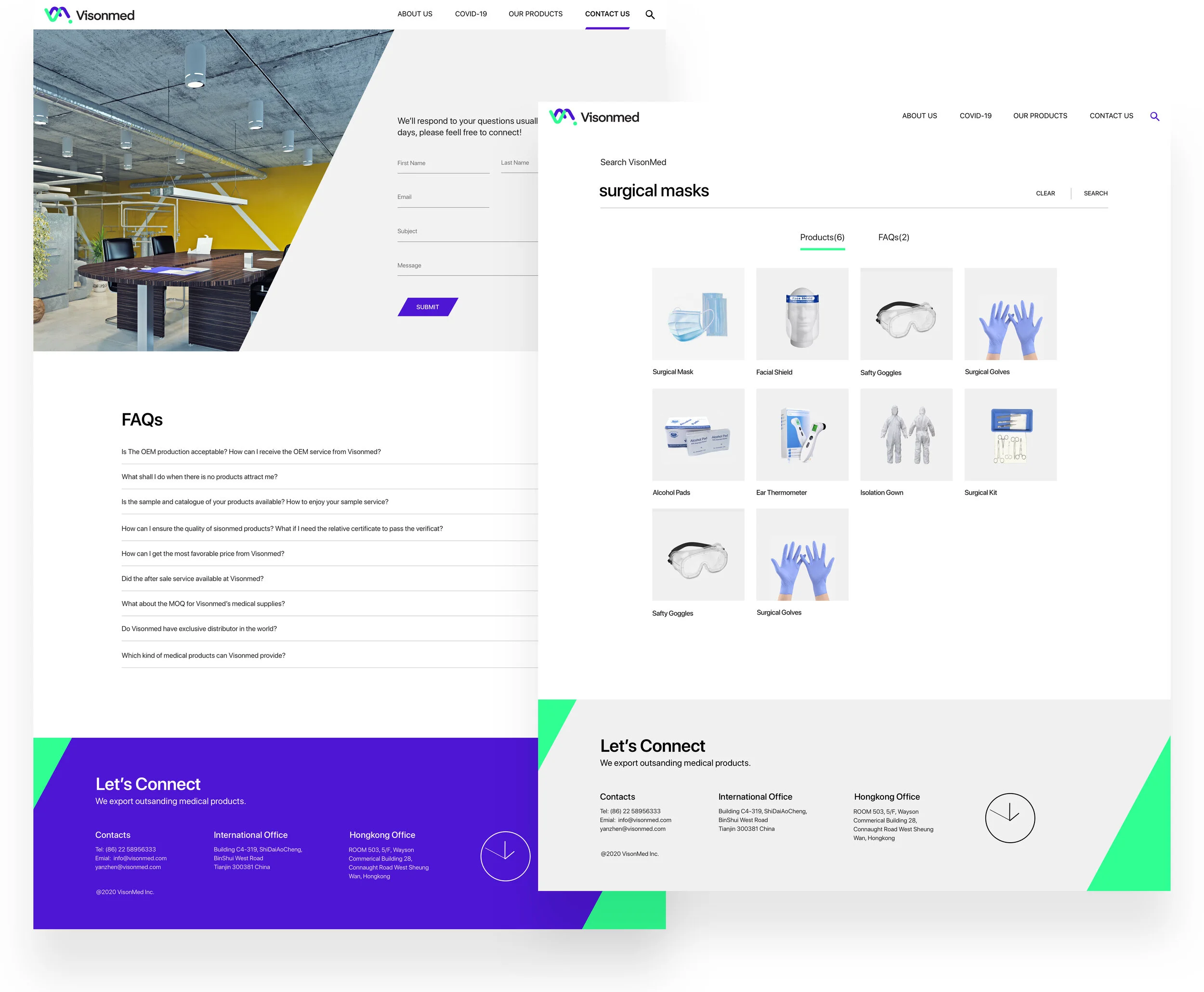
Facilitating better communication through messaging, FAQs, contact details and a time zone accurate clock.
Design System
Responsive Layout
Margin 24 px and Gutter 24 px


